It’s easy to hit a creative wall when you’re building landing pages for your audience. And sometimes, the only way to get through it is to flip through some high-quality examples.
Whether you’re new to landing pages or in desperate need of a little inspiration for your next marketing campaign, here are 4 SaaS landing pages that offer some valuable lessons.
Asana
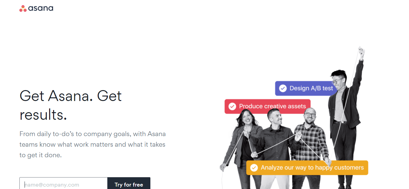
From top to bottom, Asana’s site has all the features a solid SaaS landing page needs. The design is clean and full of white space, which helps site visitors navigate the page and focus on the important pieces of information. The graphics and images are strategically chosen to supplement the copy and guide the reader downward. And the page repeatedly points to a single CTA – decreasing distractions and increasing the likelihood of the desired conversion.
The copy on the page is also great. Right off the bat, Asana offers their core value proposition, and below it, they provide supporting points like benefits and social proof to strengthen their appeal. They then bookend the landing page with a final “free trial” call to action.
The only major drawback to this page is the layout of the benefits section. Being right next to another CTA, it creates competing visuals for the audience to focus on.
Score: 9/10
Interesting in seeing the whole landing page? Check it out here.
Shopify
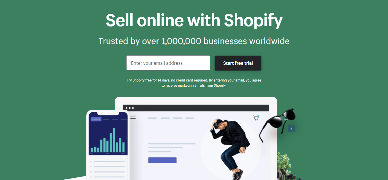
Shopify’s page has been shared dozens of times over the years, as a prime example of a quality landing page. But given that they’re still using it, it’s clearly doing something right.
This year, the design has been updated slightly, but it’s nonetheless gorgeous to look at. Beyond the natural color palette that uses muted greens and blues, the design is simple and clean. The margins and breaks between sections use lots of white space to keep things organized and uncluttered. And the design also uses natural curves and lines to direct the eye further down the page.
Shopify also follows landing page best practices here, by including a value proposition, benefits, social proof, and a single CTA to encourage the visitor to offer their email address and click-through to the next page.
Best of all, Shopify removes all the unnecessary stuff – like navigational options – so that the reader doesn’t get distracted.
Score: 10/10
Want to see the landing page in action? Check it out.
Typeform
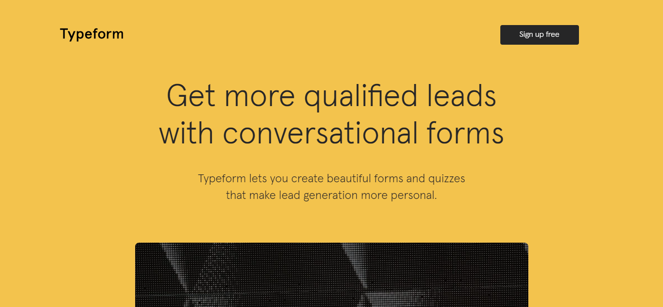
Typeform takes a bit of a unique approach to their landing page by including interactive elements. Just below the main value prop and hero text, they embed a survey, which serves as their CTA. In doing so, they give you a taste of their product and create a frictionless alternative to the standard landing page form.
While the design is great above the fold, with no navigation bar and minimal distractions, that isn’t necessarily true as you move down the page. In fact, Typeform offers six additional CTAs that viewers can select in addition to the primary CTA. Arguably, this can technically be useful as some visitors prefer a lower commitment action. However, with so many options available, the main CTA ultimately loses a little bit of its umph.
Score: 7/10
Want to have a look around this landing page? Here’s the link.
Pipedrive
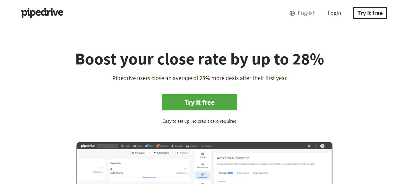
Pipedrive gets just about everything right. The navigation bar is non-existent. The value prop is clear and compelling (numbers are always a huge plus!). There’s loads of white space around the page. And the call-to-action is solid and easy to follow through on – especially with the addition of the microcopy underneath the CTA button.
The SaaS landing page takes it a step further than most others, though, by highlighting a pain point first and then following up with the solution and benefits sections.
Arguably, the smartest aspect of this landing page is the built-in comparison chart, because it eliminates the need for site visitors to leave to do more research. Everything from their price and Capterra score to their integrations and must-have features can be stacked up against any of their competitors. All visitors have to do is select one or two from the dropdown lists.
Score: 10/10
Want to see the full landing page? Click here.
Landing pages are tricky to master. You have to get the UX just right to keep your site visitors scrolling instead of bouncing. Luckily, there are a lot of SaaS landing pages out there that you can learn from before creating your own.
Want to know more about how landing pages work and what best practices to use when building one? We’ve got the details in this blog post.